Slow Read: Week 2
The ToolBox
What are we looking at, anyway?
All my repeat students know that their first assignment in any art history class will be a visual analysis. It doesn’t matter if it’s their intro course or their advanced contemporary theory course; they will have to look closely and explain how the artist’s choices about line, shape, form, value, color, space, and texture create unity, balance, movement, rhythm, emphasis, or contrast in the work.
A visual analysis breaks an artwork into parts in order to understand how it functions as a whole. We make a claim about how the artist uses formal elements to create principles of design. And then, we support that claim with visual evidence.`
The formal elements are the ingredients of visual art and culture. I liken the principles of design, on the other hand, to flavor profiles or what an artist actually does with the ingredients. I often tell my students that my own cooking almost always begins with some fat, onions, and garlic. Those are my culinary ingredients, my basic elements. But then, I can use those elements to create an Italian dish or a Korean one. Likewise, an artist can use line and color to create emphasis, to unify a composition as a whole, or to do any number of other things.
When I first started teaching, I would have resisted the formula for analysis that I offer in this chapter. But after ten years of teaching undergraduates, and especially teaching students who worried that they weren’t “artsy enough” to understand art, I found this structure to be really empowering to beginners. My biology and economics majors know what to do with a chart. It helps remove some of the mystery that can obscure what I like to think of as “good looking.”
This chapter is what I’ve wanted to give to my students for years. Now you can have it too.
You can download the image above for a phone-sized version of the chart, or go to the website for a full page pdf.
You might also find it helpful to have the images page of the website pulled up so you can easily reference the difference artworks that I mention as I’m explaining the different formal elements and principles.
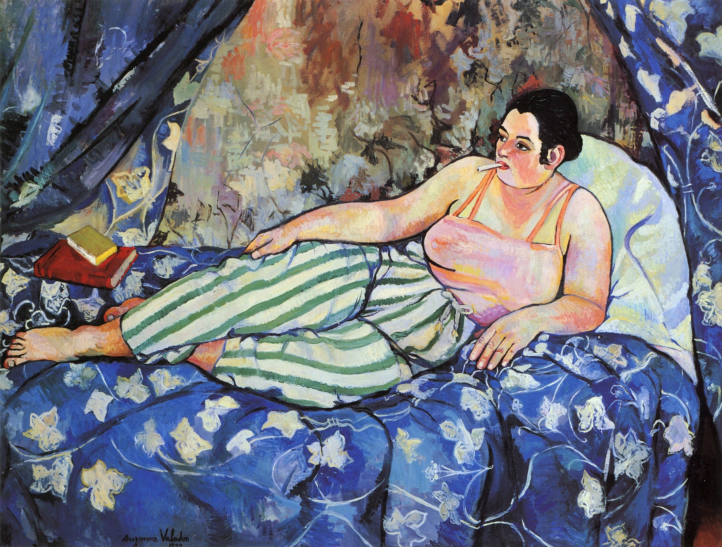
A visual analysis is an argument, not a magical key to understanding. That means that there might be stronger and weaker visual analyses, and we might even disagree about what formal elements or principles are most important in an artwork. Take Suzanne Valadon’s Blue Room (1923), which I use as an example on pages 36-37.
I could start on the right hand side of the chart above and say, “Wow, this painting is really balanced overall. I think Valadon does that through her use of space and color.” But someone else might want to focus on how Valadon emphasizes the woman, despite all the other visual busyness. What formal elements does Valadon employ to create emphasis? I think line, space, and color are doing a lot of work here. Or, maybe we first pay attention to the color blue and the warm pinks and peaches, and we realize that Valadon uses this contrast to also emphasize the woman.
We’ve been trained culturally to skip to interpretation and judgment when we look at images. We want to jump straight to what something means and whether or not we like it. But embodied vision means that we take the object itself seriously. Before we explore why Valadon might be painting a woman whose pose is familiar in western art history but whose bodily proportions and attire are more of a surprise, we need to pay attention to how she arrests our attention.
There’s a lot of information in this chapter. It’s okay to take this chapter as a reference, something to come back to when you’re looking at something new. I purposefully use the same terminology throughout the rest of the book, just to model—over and over again—how this practice of visual analysis can work.


